True Palaeogeographical Outlines
Among the projects included with the GPlates download is the set of palaeogeographical reconstructions by Cao et al. (2017) for the last 402 Ma. These are based, and so should align nicely, with the Golonka (2007) model that is used for data in the PBDB, which we’ll get to below. These data are in GPlatesSampleData/FeatureCollections/Palaeogeography/Global/.
Reconstructing Geography with Occurrences
Cao et al. (2017) used a combination of previous palaeogeographical reconstructions, and updated the coastlines, mountains, and extent of land and ice caps using occurrence data from the PBDB. In a few locations, what had been reconstructed as land produced marine fossils, when accounting for the movement of plates, and vice versa.
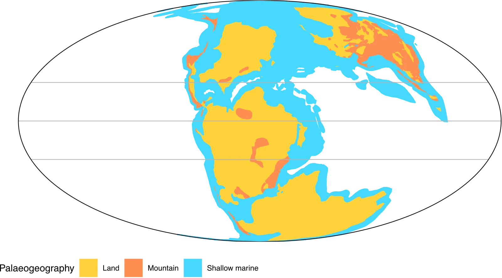
These reconstructions include four layers that have the separated palaeoenvironmental regions:
- Shallow marine: shelf seas.
- Land: terrestrial habitats outlined by coastlines.
- Mountain: areas of mountain building and uplift.
- Ice cap: polar regions that have substantial evidence for long term presence of ice.
These are given the abbreviations ‘sm’, ‘l’, ‘m’ and ‘i’. It’s worth noting that the way these are built means that the layers have to be plotted in the order above – shallow marine first, ice cap last. There are various areas that overlap (Australia especially) so the order of overlay becomes important in making the correct boundaries visible.
Export from GPlates
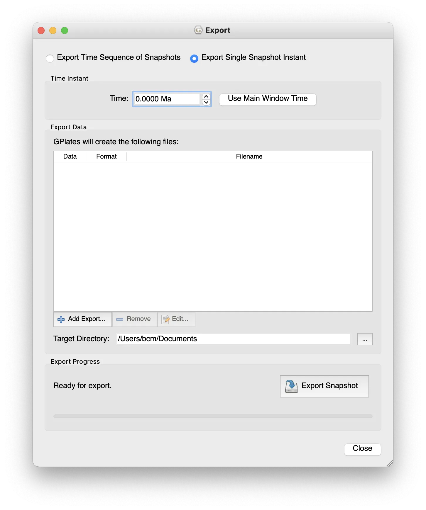
The Cao et al. (2017) reconstructions aren’t available from GWS, but can be exported from GPlates directly using the menu item Reconstruction > Export… Like above I’ve already done this for an example data set, in this case using the Late Jurassic (Kimmeridgian, 155 Ma) as an example. To make your own, once in the export window:
- Select the time of export (can be set from the main window time).
- Also an option to export a series at regular intervals.
- The layers to export
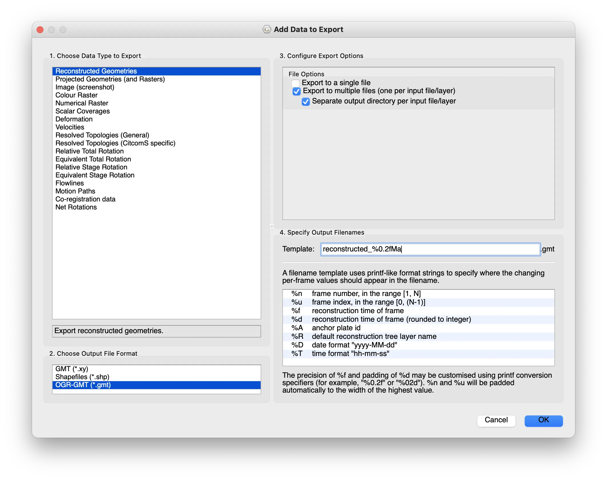
- select Add Export… under Export Data
- choose Reconstructed Geometries
- output as OGR-GMT
- choose single or multiple files
- I prefer multiple: you get one file for each of sea/land/mountain/ice. This is the form that works with the code below.
- OK
- Change Target directory: to somewhere you can find.
- Begin Export


The example data are in data/palaeogeography as three .gmt files that describe the polygon outlines for each of the layers. Note that as there are no ice caps at this time, there are only three files/layers. Look at the Carboniferous or later Palaeogene to get some ice caps.
Read in the map data
I find it useful to tie together the layers and colours from the beginning of importing – this ensures keeping the layers in the order for plotting. The data files are:
lm_402_2_reconstructed_155.00Ma.gmt: landmassm_402_2_reconstructed_155.00Ma.gmt: mountainsm_402_2_reconstructed_155.00Ma.gmt: shallow marine
This short code snippet sets lists the layer names and assigns the colours for each layer on the map – they are similar to those shown in GPlates, but not quite the same. I’ve also used #DAD3FF for ice caps when needed. (Technically this isn’t used for the colours, that’s in the palaeogeog_map_niceties function, this is somewhat a remnant of a previous way that I made this.)
map_layers <-
  c(
    "Land"           = "#FFD23A",
    "Mountain"       = "#FF8D51",
    "Shallow marine" = "#45D8FF"
  )
With that ready, the following code reads and tidies the data (as for above), then adds a column (geog_layer) to identify the data layer (shallow marine, land, mountain) and joins all the data together. It’s very tidyverse based, so I’d suggest looking at https://www.tidyverse.org to see the rationale and how they link using the pipe (%>%). You can also see more about individual functions in the R help.
The final step is to create a column (polygon_id) to identify each region. I had a long issue where different continents would join up, or Australia’s land would always appear plotted underneath the sea. As described above, this is because the shapes on the map are plotted as separate polygons, and the IDs are repeated between each of the layers. We’ll use the polygon_id column to make sure that each polygon has a unique ID by joining the layer, group and id name from the tidied data.
polygon_data <-
  list.files("data/palaeogeography/", pattern = ".gmt", full.names = TRUE) %>%
  map(readOGR) %>%
  map(tidy) %>%
  map2(
    names(map_layers),
    ~ add_column(.x, geog_layer = .y)
  ) %>%
  bind_rows() %>%
  mutate(
    polygon_id = str_c(id, group, geog_layer) %>% as_factor(),
    geog_layer = factor(geog_layer, labels = names(map_layers))
  )
Arranging the map layers
At this point it’s important to have the map layers in the correct order, so that marine is plotted under land, which is plotted under mountain.
This piece of code does that for you, ensuring shallow marine is first (it was third in map_layers above) then assigning this order to the polygon_id column. It converts the polygon_id column to a factor and re-orders thee levels based on the reordered map_layers.
id_level_order <-
  map_layers[c(3, 1, 2)] %>%
  map(
    function(layr) polygon_data$polygon_id %>%
      levels() %>%
      str_which(layr)
  ) %>%
  unlist()

polygon_data <-
  polygon_data %>%
  mutate(
    polygon_id =
      fct_relevel(polygon_id, levels(polygon_id)[id_level_order])
  )
Easier, Automated Plotting
Unfortunately, using the same plot layer method as for the GWS data above is a little excessive. You would have to add a new annotation for each layer (just about okay for three, tedious for more), which then multiplies when plotting reconstructions of many times.
# EXAMPLE CODE: DO NOT RUN
ggplot() +
  geom_map() +
  geom_map() +
  geom_map() + …
Instead, you can use the function geom_polygon and have the different layers plotted automatically with the colours assigned above. The fill is the most important argument as that assigns the main bulk of the colour. The colour argument is the outline, which you shouldn’t use as that will outline the map layers and change their shape. The colour argument will be used when plotting occurrence points (see below). Also having the ordered and correctly grouped polygon_id is important here as that determines how the individual polygons are grouped and closed, preventing shapes from spanning the globe, or incorrectly overlapping.
I’ll point out here that there’s quite a lot going on in the palaeogeog_map_niceties function at the end. This is a collection of theme options and a colour scale to show the map properly. In particular this adds the outline and the lines of the equator and tropics. I guess one thing to note is that the ‘tropics’, in a biodiversity sense, may not be the same in the past as the present. Increased temperatures can change the latitudinal biodiversity gradient. Also, obliquity and precession change the latitudes of the astronomical tropics through
time.
# dev.new(width = 7, height = 4)
map_plot <-
  ggplot() +
    geom_polygon(
    data = polygon_data,
    aes(
      x      = long,
      y      = lat,
      fill   = geog_layer,
      group  = polygon_id
    ),
    colour = NA
  ) +
  coord_map("mollweide") +
  theme_map() +
  palaeogeog_map_niceties()
map_plot

You can try changing the look by modifying the projection (coord_map) and play about with some of the colours and markings by editing the function palaeogeog_map_niceties (functions/palaeogeog_map_niceties.R). You can also add further annotations (https://ggplot2-book.org/annotations.html#annotations) or
change labels as you wish.
Going further 1: locating with modern coastlines
You may also want to add outlines of modern coastlines to show where these are and help locating. Again these are not available from GWS, but can be exported from GPlates. In GPlates, from File > Open Feature Collection… go to GplatesSampleData/FeatureCollections/Coastlines and load Matthews_etal_GPC_2016_Coastlines_Polyline.gpmlz. This adds a new layer into GPlates with areas of modern coastline in their relative positions for the time. Not all the modern coastlines are there as not all of these have certain locations, or rock to be found at – these come and go at different time points.
Like above, you can export this layer from GPlates. In this repo, I’ve already done that to data/coastlines/, which you can load with this code.
modern_coastlines <-
  readOGR("data/coastlines/Matthews_etal_GPC_2016_Coastlines_Polyline_reconstructed_155.00Ma.gmt") %>%
  tidy() %>%
  add_column(geog_layer = "Modern coastlines") %>%
  mutate(
    polygon_id = str_c(id, group, geog_layer) %>%
    as_factor()
  )
This layer needs the same organising of IDs as the palaeogeography above, but once done can be easily added to map_plot above. This is where it’s useful to save your ggplot to an object alongside printing it – this you can just add new layers on top of the base map.
map_plot +
  geom_path(
    data = modern_coastlines,
    aes(
      x = long,
      y = lat,
      group = polygon_id
    ),
    colour = "#888888",
    size = 0.3
  )

Exercises 3
- Try plotting this map with different projections (see above and
?mapproject). Does this work well for all projections? Why? - Look at the code behind
palaeogeog_map_niceties()(infunctions/palaeogeog_map_niceties.R). Modify this to add different lines of latitude. Can you add lines of longitude too? What about changing the colour?- ggplot objects can have new layers added to them one-by-one by using
+, but you can also combine them into function containing a list of layers that can be added in a single line. - Hint: to change the colour of the map layers, use
fill.
- ggplot objects can have new layers added to them one-by-one by using
- Can you try creating your own palaeogeographical map for your favourite time? This should be done on your own computer. Follow the instructions above to export data from GPlates then plot in R, making sure you change all the file and object names.
References
Cao, W., Zahirovic, S., Flament, N., Williams, S., Golonka, J. and Müller, R.D. 2017. Improving global paleogeography since the late Paleozoic using paleobiology. Biogeosciences 14 (23): 5425–5439. doi:10.5194/bg-14-5425-2017
Golonka, J. 2007. Phanerozoic paleoenvironment and paleolithofacies maps: Mesozoic. Geologia 33 (2): 211–264. article site
Leave a comment